Graduate Thesis
The problem:
Obesity is one of the leading causes of death in the United States, but physicians don’t often talk to their patients about this disease, or nutrition and lifestyle changes to prevent and manage it. This is the case because they often don’t have time to go into a detailed discussion about these non-acute problems, or find it uncomfortable to talk to patients about a taboo topic, such as their weight. While acknowledging that weight is not an indication of health, excess adipose tissue (aka fat) is a contributor to many serious diseases such as heart disease, diabetes, and cancer, to name a few.
The solution:
For my graduate research, I wanted to design an app to communicate nutrition, exercise, and obesity information in a way a lay audience could understand their condition, and what they could do to manage it. To keep app users motivated to continue using the app and learning more about health, I employed gamification strategies. Reading about Yu-kai Chou’s practical approach to gamification, that life is a game, to me it was an exciting challenge to gamify something as vital as maintaining a healthy lifestyle.
The methods:
My first step was having a discussion with healthcare providers and dietitians that interact with this population regularly. From these discussions, I was able to understand what health care providers perceived the problem to be. I created an outline of an app that could encompass almost everything talked about during the discussions. After deciding what features the app should have, I began to create sketches for the layout of the app, or a low-fidelity wireframe, and the general flow of the app, or a site map. Both of these would go through multiple revisions in a process called iterative design. It is a process of creating, testing, refining, and testing, until the perfect product is achieved. While the scope of my research did not allow time for the “perfect product”, learning these principals was vital to future research.
Low-fidelity wireframe
First stages of site map
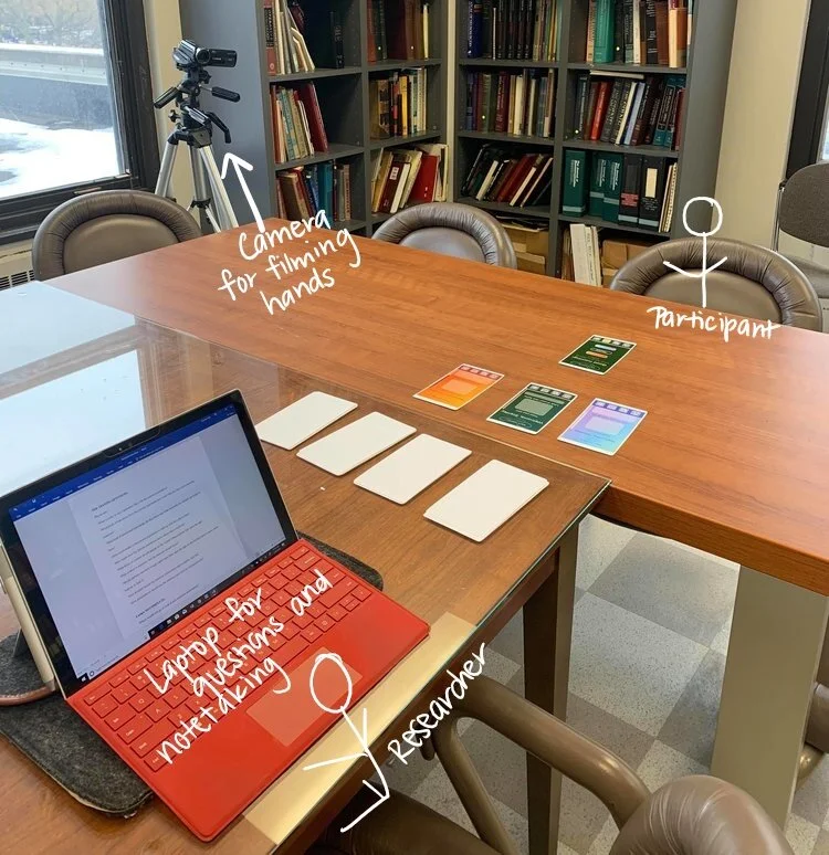
After creating the low fidelity wireframes I revised them and to create more polished, or high fidelity, wireframes in Adobe Illustrator. They were printed out to be used for the paper prototyping process, which included health care providers performing “tasks” to navigate through the paper wireframes as if they were a mobile device. This usability testing was useful for receiving feedback about organizational choices, design decisions, as well as improving functionality based on the specific population’s needs.
Illustrator file of high fidelity wireframes
Example of printed out “test” wireframe
Setup of usability testing
These three wireframes would be presented sequentially to the participant after they “click” (tap on the paper) on the corresponding buttons to create a goal.
After usability testing, many parts of the app changed. For example, the “Home” button was originally the “MyBody” logo located at the top of each screen. After testing, I found that this was not intuitive to most users.
First round of app icons. It was not evident that the icon on the far right led to a page containing facts. There was also no home button in this icon row.
Modified app icons. Words were added to the icons, the facts icon was modified for clarity, and a home button was added.
After usability testing, the site map was again revised to reorganize information that was confusing. The blue line in the site map indicate what functionality is also featured on the home screen, that users can go to directly.
Final site map, revised for feasibility and usability
After reviewing feedback from usability testing, the app creation process began in Unity 2D, a game engine. Between the paper prototype and the actual app, there were changes made not only from user feedback, but also because of technology and time limitations. At the end of the study, I created an app that was built out for and worked smoothly on an Android phone (time and technology limitations did not allow for me to go through the Apple App Store).
Example of code that I used to create my app in Unity. Left) Unlocking different accessories for pets based off of points, Right) Adding, editing, and saving text into the MyGoals tab, as well as increasing points when a goal is “checked” as completed
For testing change in knowledge, I used printed fact sheet handouts as the control group. These fact sheets contained the same facts that were presented in the app. The difference is that on the app, facts were not available all at once, but appeared sequentially after opening the app each new day.
This app was tested over a course of two weeks, in an experiment that compared information retention through an app vs. through printed handouts. Due to a small sample size, no conclusions could be drawn about the efficacy of the app, but valuable qualitative data surrounding content of a health app, user-centered organization, UI/UX design, and iterative design was gathered.


