Logo, Branding, and Website Design
This project that is near and dear to my heart all started in the summer of 2020. A dear friend had told me that her friends were starting a farm in Wisconsin, a new kind of farm. A farm that wanted to change the game surrounding sustainable agriculture, food equity, and honoring the lands that they work on. Patty and Ky from Wonka’s Harvest wanted to do this through not only their sustainable farming practices, but also through educational experiences geared at kids, to make them enjoy eating fruits and vegetables by learning where they came from. They also dreamt of having a completely different business model for their CSA (Community Supported Agriculture), a pay-as-you-can model that would ensure that those who needed fresh produce would have access to it at a price they wanted, and delivered to their doorstep. I was thrilled to play a part in helping them achieve their mission and thus making the world a better place.
I was excited to use my knowledge of graphic design, website design, and UI/UX design to begin developing their logo, branding, and website. Through our meetings, they told me that they wanted something that was fun and approachable for children, but also sophisticated enough to draw in adults. I wanted to showcase their commitment to the earth, learning, and community. After a couple rounds of different logos, the one pictured below was finalized!
Logo mockups for Wonka’s Harvest
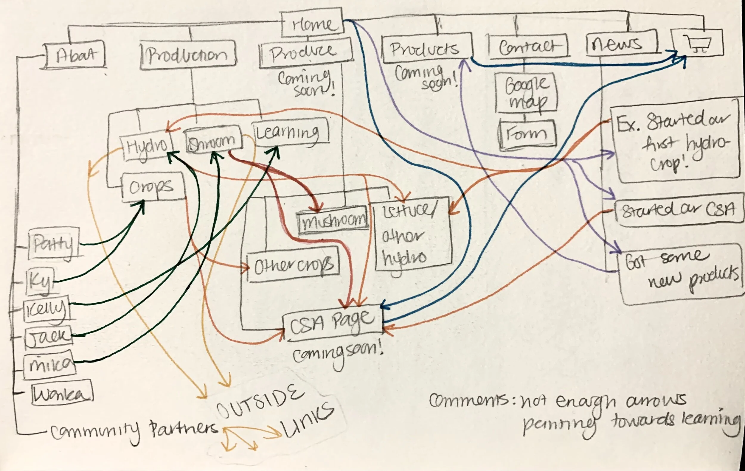
After settling on a logo and a general color scheme, it was time to start designing the website. We discussed content. flow, voice of the website, who our audience would be, what content they would like, and how they would want it to be delivered. After our initial discussions, I came up with an initial site plan for the website. As time went on, that site map changed as per their changing needs. This was also my first time setting up an extensive store on Squarespace. While Wonka’s Harvest sells some merchandise, their main source of income is the CSA, which is all handled through the website. To set this up, we talked about the best way to execute a pay-what-you-can model on an online platform, thinking about minimizing the amount of hoops one might have to jump through to truly be able to “pay-what-they-can”.
We also wanted the website to make each visitor feel like they were actually visiting the farm and a part of the Wonka family. Patty and Ky had the great idea of putting a map of the farm on the front page, with links leading to different places on the farm. It was my job to make that dream a reality. So I set to work researching how to make interactive maps, and sent them samples of different illustration styles that went with their fun theme. Finally, I was able to create an interactive map for them, where a visitor to the site can click on on image on the map and be taken to a blog post about that particular location on their farm. This was really fun to create because not only did I get to illustrate cute farm life, but I also felt like this added a wonderful touch to their website.
After playing around with three illustration styles of varying intricacy, we decided to go with the third one. Shown below is the base map, on which the gray shapes will be filled in by various locations and activities on the farm. Click on the map to go to the Wonka’s Harvest website, where you will see an updated version in action!
Working with Wonka’s Harvest has been an absolute joy and an amazing opportunity for me to learn and grow as a website designer. I also cherish the friendships I’ve formed with the entire Wonka’s team. I look forward to continue working with them from the website design aspect, but also in creating materials for nutrition education and advocacy.


